ÖNCEKİ
21 KASIM, CUMARTESİ, 2015
SONRAKİ
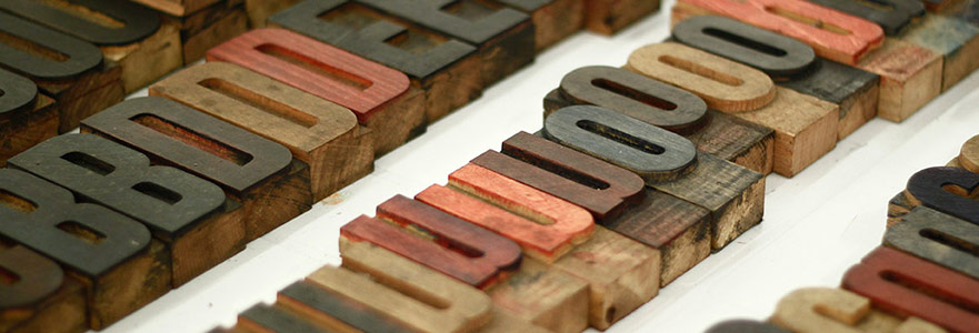
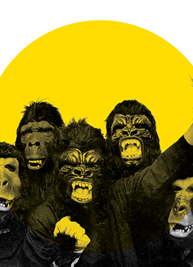
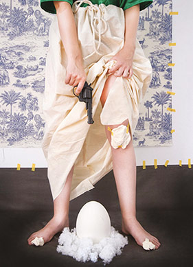
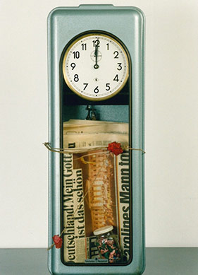
One of the projects realised in Mixer within the scope of 600th anniversary of Poland-Turkey relations is Design Critique Platform Workshop. The New Locality. Project deals with typography, 'samizdat' culture, street art, the sociology of typography and many other subjects alike. Robert Chwałowski, who is the director of academic typography course in Cardinal Stefan Wyszyński University, Robert Kwiatek, who is the founder of solidarity organization in Gdańsk called Federation of Fighting Youth "Solidarity" and is also a Polish photographer, printing artist and publisher, researcher and a typography artist Marian Misiak, Katarzyna Roj, who is the education and exhibition director of BWA Wrocław-Galleries of Contemporary Art, and the design critic and curator Agata Szydłowska, Marcin Rutkiewicz, who is the founder and director of Outdoor Art Foundation and is also one of the writer and curator of Forty / Forty Gallery of Warsaw as well as Miastodwa, who is working on Typography and the sociology of visual language and collectives like Studio Arizona making magazine and poster designs with risography, have organized ateliers and made speeches last week for the project, which has been transforming Mixer into an atelier since 30th October. At the moment illustrator Jan Bajtlik, whose illustrations have been published in many publications such as “Time Magazine”, “The New York Times” and Mert Tügen, who illustrates various publications, designs book covers such as Bant Dergi, Can Yayınları are working on a special Istanbul ‘Phrasebook’ for the project, which is going to end until 23 November. If you wish to witness their process, you can stop by in Mixer until 19th November or you can own the booklet that they have prepared at the end of the process.
What is Design Critique Platform and who forms this platform?
Design Critique Platform is a ‘think tank’ aiming to gather information and to make critical commentary on design in its wider sense in Poland and Europe. It was founded by Agata Szydlowska, who is a critic and a design curator, and me - Rene Wawrzykiewicz, who is designer and curator. We are organizing exhibitions, conferences, presentations and other events on the role of designer and function in our contemporary society. We are researching what design is in our environment and what it serves in practice. According to us, the critical view is important for designers to understand themselves and to see their place in the works.
What do you know about the design world in Turkey? Do you follow?
We met with a couple of Turkish designers such as Bülent Erkmen and Yeşim Demir.
But what really interest us is the collision and the gathering of Europe and Asia as well as tradition and "modernity" side by side that is unique to Turkey. Polish culture also is face to face with these kinds of developments; yet it interests us more since these processes are stronger and more dynamic in Turkey.
The workshop in Mixer. You have done and are doing many workshops related to typography within the scope of your The New Locality project. What is the importance of typography in our daily life?
Letter is the major graphical symbol, with which people communicate, transfer knowledge to each other and gather information through typography. The images of fonts, the style of letters, typographic system and the method to use these symbols: all these reflect a society; they definitely and certainly show social and political developments and emphasize economical rules.
What do you think is the relationship of typography and graphic design with politics?
Letter, words carry a certain meaning, function and feelings in graphic form all the time. Even if we are not aware of this sometimes, letters and fonts, typography, which form the words, always have political or economical messages. For instance, Helvetica is a font of big cooperation and business world. Therefore even the press was using hand written slogans in order to form a new language in 'occupy' movements in world as well as Gezi Movement in Turkey that happened last year.
Some of the key words of the Workshop, The New Locality Project, that you used Mixer as the venue: political, activist, a little bit 'underground', retro, vintage, creative. Have you chosen this kind of framework specifically for Istanbul/ Turkey or else can the understanding of Design Critique Platform's understanding be summarized with these words as well? Turkey attracts our attention a lot. Because, although social and economical developments are similar to Poland, the developments here are more dynamic and more comprehensive. Therefore, we wanted to compare the similarities and differences between two countries by referring to important subjects from the graphical history of Poland and its current state in Istanbul.
Some of the key words of the Workshop, The New Locality Project, that you used Mixer as the venue: political, activist, a little bit 'underground', retro, vintage, creative. Have you chosen this kind of framework specifically for Istanbul/ Turkey or else can the understanding of Design Critique Platform's understanding be summarized with these words as well?
Turkey attracts our attention a lot. Because, although social and economical developments are similar to Poland, the developments here are more dynamic and more comprehensive. Therefore, we wanted to compare the similarities and differences between two countries by referring to important subjects from the graphical history of Poland and its current state in Istanbul.
Evaluating in the name of typography and visual language, what would you say about Istanbul?
The name of the apartments in front buildings did really attract our attention. The names of the building are written over on the entrance on most of the houses, which are in different typographic forms unique to a certain period. The informative function and its blend with the tradition of a certain place of this interesting typography did surprise us and we really liked it. We found it very interesting since there is no tradition as such in Poland.
;